
Luminary Finance
A challenger lender that looked like every bank it set out to replace. We built a brand on clarity and warmth, from the name system to guidelines its product team actually uses.
Banking That
Feels Human
Luminary was cheaper, faster and friendlier than the banks. Its brand said none of that.
Discovery
Interviews with forty customers and a map of every competitor's promise showed a category drowning in blue and saying nothing at all.
Strategy
One promise, money made clear, gave the product, marketing and support teams the same sentence to build around.
Identity
A bright, open wordmark, a light-led colour system and an icon set that explains money instead of decorating it.
Launch
A guidelines site, a design token library for the app team and launch assets for the first national campaign.
Money made
clear is money
people trust.
In the founder's words, prospects in the first sales meetings after launch treated Luminary as if it were twice its size.
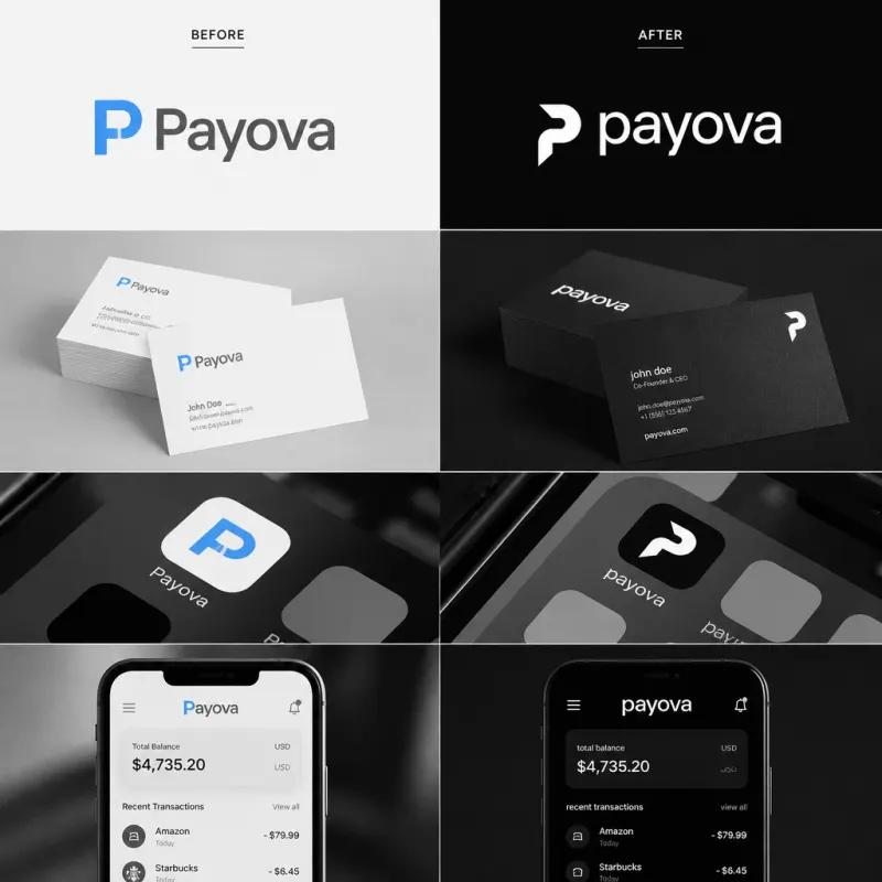
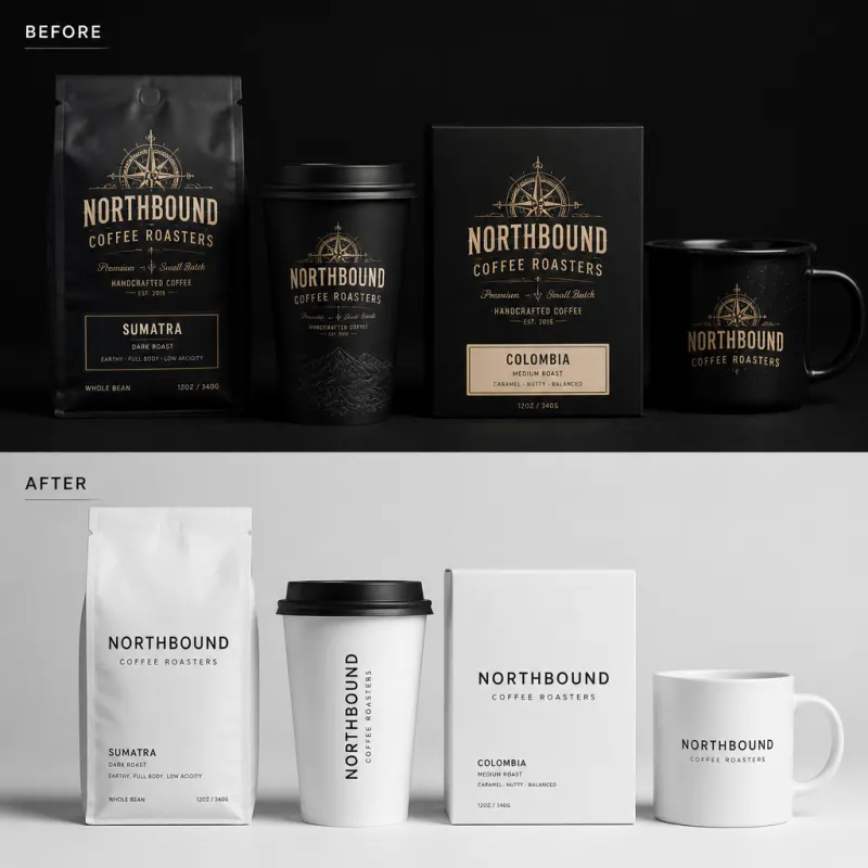
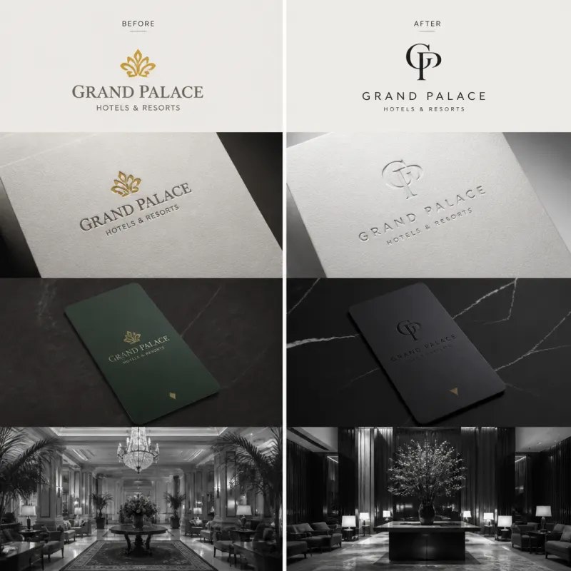
Other Brand
Transformations
Ready to Build
Something Permanent?
We take on four to six brand projects per quarter. If you are serious about your brand, let us have a conversation before the next cohort closes.
Start a Project